DENSO DESIGN
Topics
About
Join
キーワードから見つける
Featured
Works
DENSO Carbon Neutral Solutions 西尾ポケットパーク
Designers
吉岡 裕記
Chat
デンまるくん改造ジェネレーター
Information
DENSO DESIGN HX WORKSHOP 2024
Activities
[出張報告] 2024年アメリカLas Vegas
DENSO Carbon Neutral Solutions ブランディング
[出張報告] Las Vegasの休日Valley of Fire State Park
幸福のビジュアライズ
いまだからこそクルマを語る
[出張報告] 2024年アメリカCES
HXデザインがもたらす幸せDENSO DESIGN OPEN LAB 2023
マツダロードスター感性評価
ウェルビーイング研究幸福の定量化
[出張報告] Syn : 身体感覚の新たな地平
目が悪い人の裸眼の見え方を再現する方法
不良品管理システム黄伝モバイル
プロトタイピングとAI
山本 佳
#UI #UX #Web #Branding #デザインガイド #デザインシステム #ビジョンドリブン
笠井 洋志
#Product #UX #HMI #移動の価値を考える
星田 浩貴
#Product #UI #UX #Branding #Prototyping #ELEXCORE #感染力を明らかに
神田 祐子
#Product #Prototyping #HMI #可視化 #プロモーション #ELEXCORE #評価解析 #サーキュラーエコノミーを広げる
鶴見 俊也
#Product #Business #社会活動を止めない #1985-1989年入社
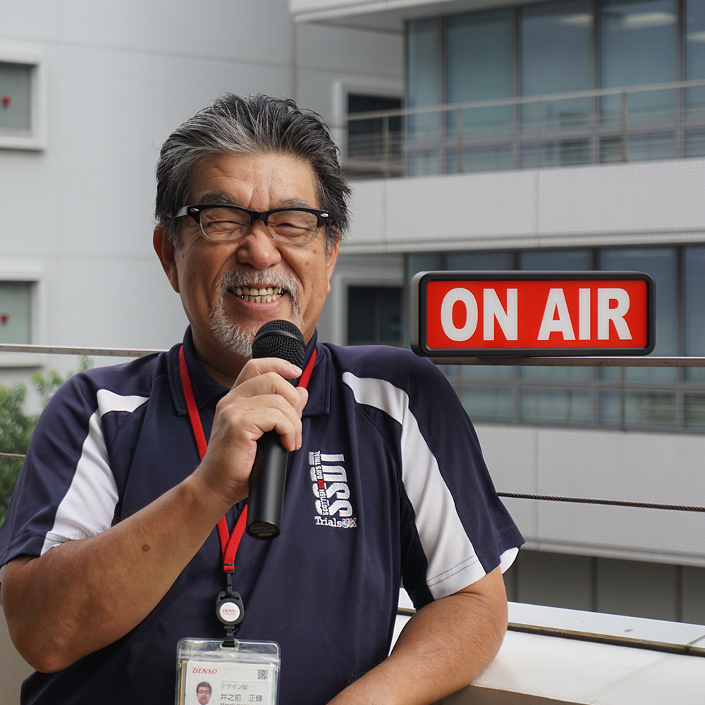
井之前 正輝
#Product #Communication #デンソー号 #ドライブにいこう #1985-1989年入社
山田 武志
#まんが #アプリ #Illustration #CG #Web #UI #ビジュアライズ #AI #Product #Graphic#1985-1989年入社
堀田 朋美
#子育てと仕事 #働き方いろいろ #テレワークとうまく付き合う #本社オフィス #効率的な進め方を考える
森 敏史
#Product #HX #Prototyping #HMI #社外活動 #1995-1999年入社
生駒 知樹
#Product #AI #定性調査
梶田 行宏
#HX #ダイバーシティ #インクルーシブ
土屋 裕志
#Vision #ビジョンドリブン #データドリブン #LOGO #幸福循環型社会 #幸せってなんだろう? #Branding #B2Bビジネスのブランドを考える #ネーミング #ブランドをつくる #まんが #そもそも論で考える #Communication #名古屋オフィス #映像 #1995-1999年入社 #可視化 #ビジュアライズ
佐藤 麻衣子
#子育てと仕事 #名古屋オフィス #効率的な進め方を考える #1995-1999年入社
佐藤 圭造
#人間中心設計 #UI #UX #HX #ユーザビリティ #アクセシビリティ #ユニバーサル #インクルージブ #Business #Service #Branding #データドリブン #アプリ #デザインガイド #デザインシステム #調査 #企画 #要求定義 #要件定義 #基本設計 #実装 #評価 #行動指針 #設計指針 #開発基盤 #テレワークとうまく付き合う #子育てと仕事 #2020年以降入社
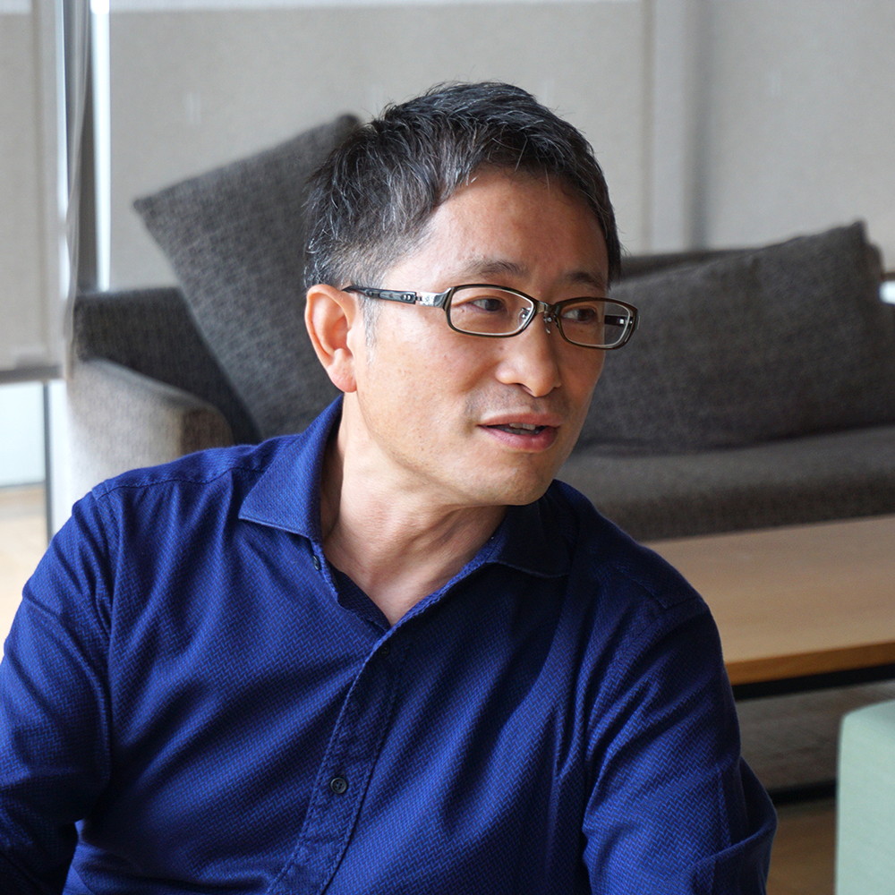
山本 博之
#HX #オープンラボ #ユーザーレビュー #ユーザビリティ #AI #海外拠点連携 #評価 #感情 #評価解析 #2005-2009年入社 #子育てと仕事
松村 将
#Graphic #Branding #Communication #Web #可視化 #調査 #サーキュラーエコノミーってなんだろう? #B2Bビジネスのブランドを考える #ブランドをつくる #2015-2019年入社 #名古屋オフィス
市村 志保
#Branding #プロモーション #ELEXCORE #グッドデザイン賞 #B2Bビジネスのブランドを考える #ブランドをつくる #Graphic #2015-2019年入社
河原 裕司
#Product #UI #HX #Vision #Branding #Business #HMI #インサイト #企画 #ELEXCORE #現地現物 #そもそも論で考える #社会活動を止めない #多様な価値観に寄り添う #テレワークとうまく付き合う #2010-2014年入社 #効率的な進め方を考える #本を読む
大山 貢司
#Product #CG #Branding #可視化 #ビジュアライズ #動画制作 #POC #ELEXCORE #原器活動 #Everycool #2015-2019年入社 #本社オフィス
大田 友絵
#HX #インサイト #ネーミング #ユーザーレビュー #人間中心設計 #テキストマイニング #評価 #脳波 #視線検知 #調査 #インタビュー #感情 #評価解析 #実車評価 #受容性評価 #主観評価 #定量調査 #定性調査 #感情分析ツール #オープンラボ #子育てと仕事 #2005-2009年入社
岡本 陽
#Product #研究 #Business #AI #ジェネレーティブデザイン #インサイト #企画 #アイデアスケッチ #Prototyping #ELEXCORE #実はこんなものつくってます #AIと一緒につくる #そもそも論で考える #安心するかたちって? #働き方いろいろ #2010-2014年入社 #グッドデザイン賞 #iF DESIGN AWARD #German Design Award #体を動かす #本を読む
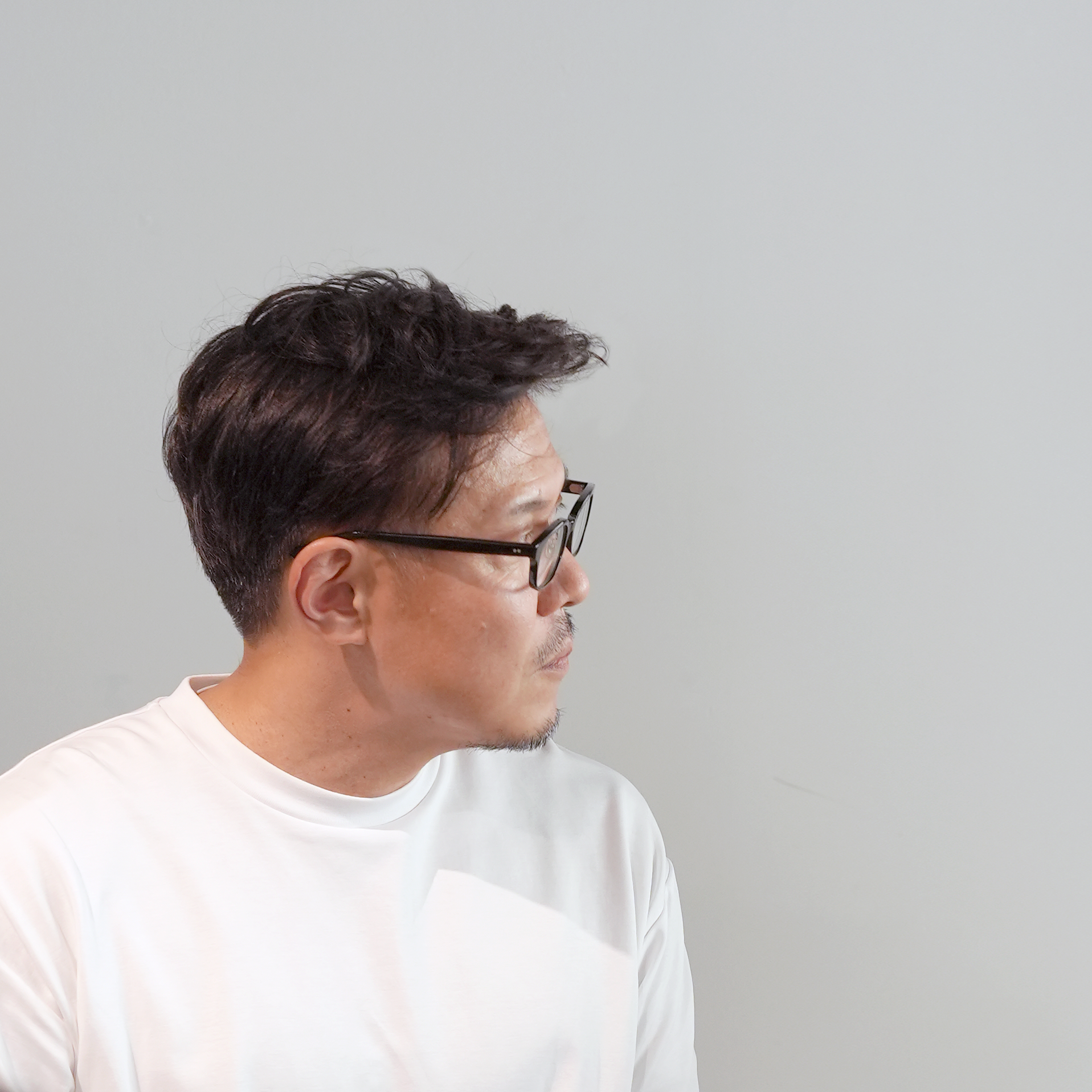
折笠 弦
#Product #Graphic #UX #CG #可視化 #映像 #現地現物 #CNブランディング #HMI #
金 智慧
#Product #Vision #可視化 #ビジュアライズ #働き方いろいろ #子育てと仕事 #2010-2014年入社
宮井 智尋
#HMI #移動の価値を考える #研究 #Vision #AI #2010-2014年入社
森 友理栄
#UI #デザインシステム #人間中心設計 #2015-2019年入社
森川 堅斗
#Product #CG #Vision #研究 #Prototyping #まんが #可視化 #AI #映像 #社外活動 #調査 #産学協同 #ビジョンドリブン #感染力を明らかに #2015-2019年入社 #働き方いろいろ #グッドデザイン賞 #iF DESIGN AWARD #さんぽ
南角 昌輝
#Product #UI #UX #Web #HX #Illustration #まんが
戸田 圭亮
#Product #UI #デザインシステム #Prototyping # 2015-2019年入社
中野 圭
#UX #CG #HX #Vision #Branding #Communication #Service #Business #人間中心設計 #ユーザビリティ #アクセシビリティ #ユニバーサル #インクルーシブ #HMI #映像 #可視化 #ビジュアライズ #現地現物 #ビジョンドリブン #データドリブン #幸せってなんだろう? #見えないものを見るちから #安心するかたちって? #そもそも論で考える #多様な価値観に寄り添う
五井 舜
#2020-2023年入社 #Product #CG #HX #Prototyping #社外活動 #ELEXCORE #CNブランディング
石川 理子
#Product #Graphic #UI #Web #CMF #Communication #動画制作 #2020-2023年入社
秋山 航平
#2020-2023年入社 #UI #Product #プロトタイピング #POC #プログラミング #電子工作 #3Dプリンタ
小川 岳哉
#2020-2023年入社 #名古屋オフィス #Graphic #動画制作 #映像 #LOGO #Vision #Branding
手塚 彩音
#2020-2023年入社 #名古屋オフィス #さんぽ # 幸せってなんだろう? #可視化
#Vision #UI #UX #CG #MovieDirection #Visualisation #MediaArt #Illustration #Service #Communication #Workshop #Prototyping #POC # Research