DENSO UI Design System2024.11.01
The DENSO UI Design System is a set of design guidelines for services and products, created to achieve both the high-quality UI design characteristic of DENSO and improved development efficiency.
-
 Yuji
Yuji
Kawahara -
 Keizo
Keizo
Sato -
 Keisuke
Toda -
 Yurie
Yurie
Mori
Relearning UI Design
As DENSO increasingly engages in software development, including systems for external services and internal digital transformation (DX), the scope of design has expanded from "creating things" to "creating experiences." Consequently, the volume of UI design tasks, which form touchpoints with users, has grown significantly. To address this, the Design Department has been focusing on recruiting and nurturing UI designers.
A few years ago, UI design at DENSO primarily centered around in-vehicle devices such as meters and car navigation systems. When designing for PCs and smartphones, relearning was often necessary. Designers gained knowledge from books and online courses, sharing insights within the team and applying them in real-world projects.

This approach has borne fruit, with achievements such as winning the Good Design Award and the iF Design Award for the development of the Defective Product Management System - Koden Mobile. As UI design opportunities have grown, so too has our knowledge base. Engineers have expressed a desire to learn about UI design and implement designs closely aligned with their intended purpose. To meet these needs and establish a sustainable mechanism for high-quality UI design, we began developing a design system that consolidates our collective knowledge.
Contents of the Design System
The DENSO UI Design System is currently divided into three main components:
Mindset
Key perspectives and considerations for planning, requirements definition, and information design.
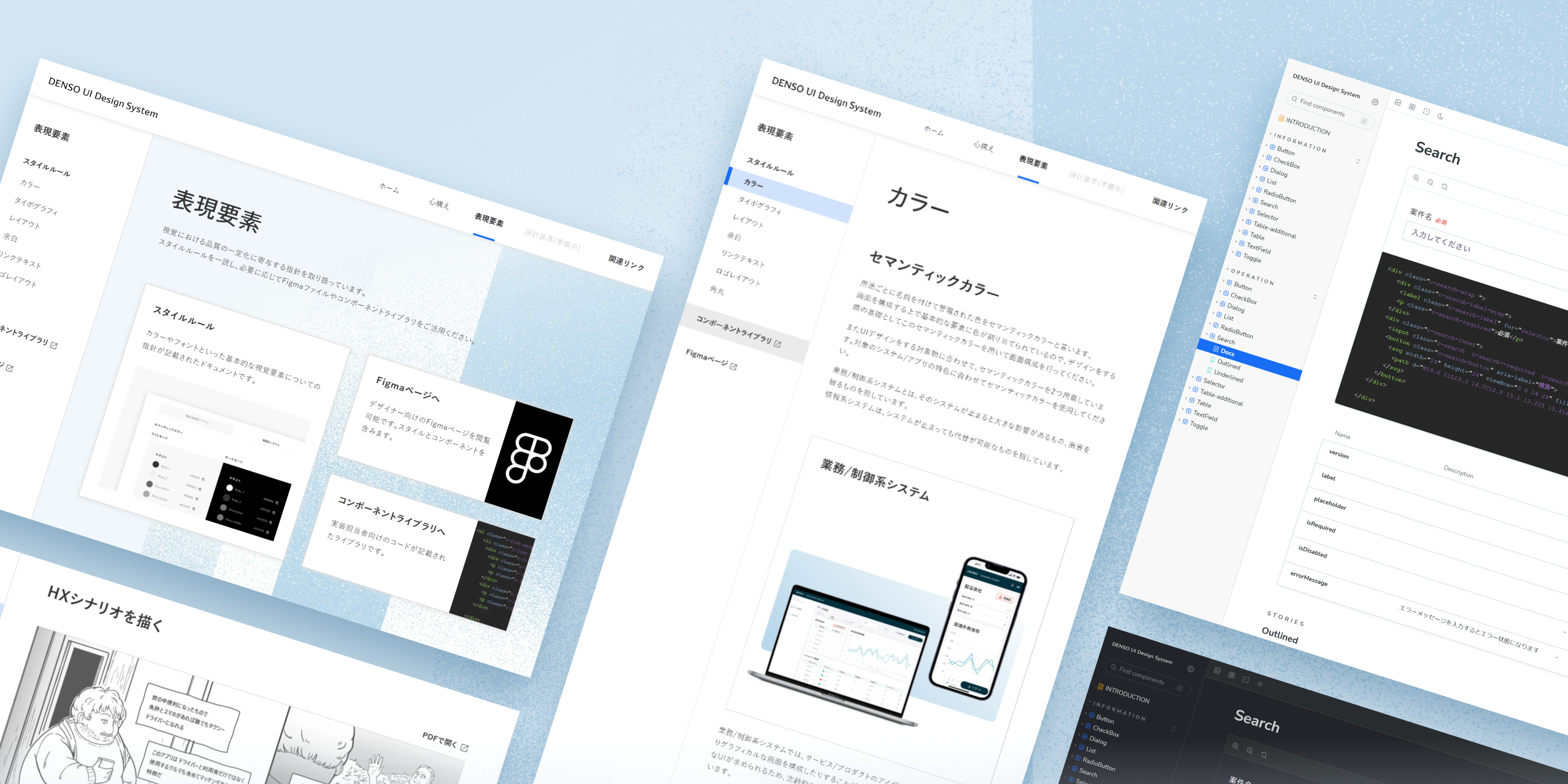
Expressive Elements
Rules that contribute to DENSO's unique design identity and ensure quality in UI expression.
Design Standards (In preparation)
Criteria for evaluating UI design quality.
This time, we'll primarily focus on Expressive Elements.

Differences from Corporate Communication Design
In creating guidelines for UI "Expressive Elements," we started with logo layouts and typography, followed by basic elements such as color and spacing.
While corporate communication design guidelines existed, they were not designed to enhance UI usability. Thus, we needed guidelines tailored specifically for service and system UI design. For example, using DENSO's brand color, red, in UI design could cause confusion about whether it represents a primary brand color or a warning color. Careful consideration was required to define appropriate color usage in UI design.

DENSO products require a wide range of designs, from those that emphasize the master brand to standalone products with no obvious connection to DENSO. Initially, we considered providing a comprehensive color palette covering all scenarios.
However, an overly extensive palette risks undermining the design process by removing opportunities for designers to craft colors that align with each brand's unique identity. To respect this creative process, we chose to forgo an exhaustive palette and instead established semantic colors for specific purposes. Primary colors for each product brand would be defined during development.
This philosophy extends to other elements, with a focus on maintaining DENSO's identity while ensuring usability.

Collaboration with Engineers
Initially, we prepared Figma files aimed at designers. However, during development, there were frequent mismatches between the design intent and implementation. To address this, we invested in tools for sharing implementation code with engineers.
Since DENSO involves engineers from various departments for each project, redesigning similar components repeatedly across projects increased workload. To reduce this, we created a component library using tools like Storybook. This library allows engineers to browse component specifications, interactions, and implementation code, which can be copied and pasted directly. This reduces communication costs between designers and engineers.

A "Jig"-like Presence
Design systems vary widely depending on the organization. Companies with strong brand consistency may enforce strict controls, while others with diverse products allow more flexibility. DENSO's approach aligns with the latter.
Over-defining makes the system impractical, while under-defining makes it meaningless. Striking the right balance took significant effort, involving repeated updates and simplifications to focus on core rules. This reflects DENSO's philosophy of diverse, adaptable design, making the system akin to a "jig"--a tool used in factories to enhance efficiency and accuracy.

Incidentally, the web key visuals for the UI Design System use motifs inspired by jigs. Like stencils, these allow for both precision and creativity, enabling the production of diverse products while maintaining efficiency.
Future Improvements

The design system has already been applied in various developments, yielding benefits such as reduced workload and more efficient knowledge sharing. Reducing time spent in the early design phase has allowed us to focus more on experience design and prototype validation, leading to improved UI quality.
We aim to continually refine the system based on real-world usage to meet diverse needs and deliver even greater value.
Tags
Member
Creative Direction: Yuji Kawahara, Keizo Sato
Project Lead: Keisuke Toda
UI Design: Yurie Mori
-
Yuji
Kawahara -
Keizo
Sato -
Keisuke
Toda -
Yurie
Mori
Other WorksAll Works


ActivitiesAll Activities