V2H App Development2025.01.30
Enabling energy transfer between home and vehicle, V2H technology is advancing with a partial renewal of its control application.


About the Request
―What exactly is V2H?
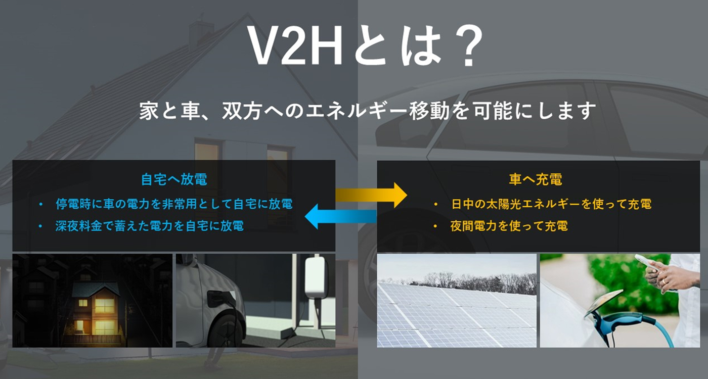
Goi:V2H (Vehicle to Home) is a system that allows the electricity stored in an electric vehicle's battery to be used in a household. You might often see people charging their EVs at home, but V2H enables the reverse as well--utilizing stored electricity from the vehicle for household use.
For instance, households with time-based electricity pricing can charge their EVs during off-peak hours when electricity is cheaper and use that stored energy during peak hours to save on electricity costs. Additionally, V2H can be integrated with solar power systems--storing solar energy in the vehicle's battery during the day and using it for household needs at night (while still allowing the vehicle to be used as needed). This setup optimizes the use of renewable energy and is environmentally friendly.
Furthermore, in case of a power outage, the EV can serve as an emergency power source for the home, making it extremely useful during disasters. Given Japan's susceptibility to earthquakes and natural disasters, V2H is gaining attention as a reliable backup power solution. Subsidies from the Ministry of Economy, Trade and Industry and local governments have also made adoption easier.
Ohyama:Since this wasn't a full app overhaul, the business division initially thought the task would be as simple as replacing the existing visuals. We took on the request without much concern.
--What kind of application is it?
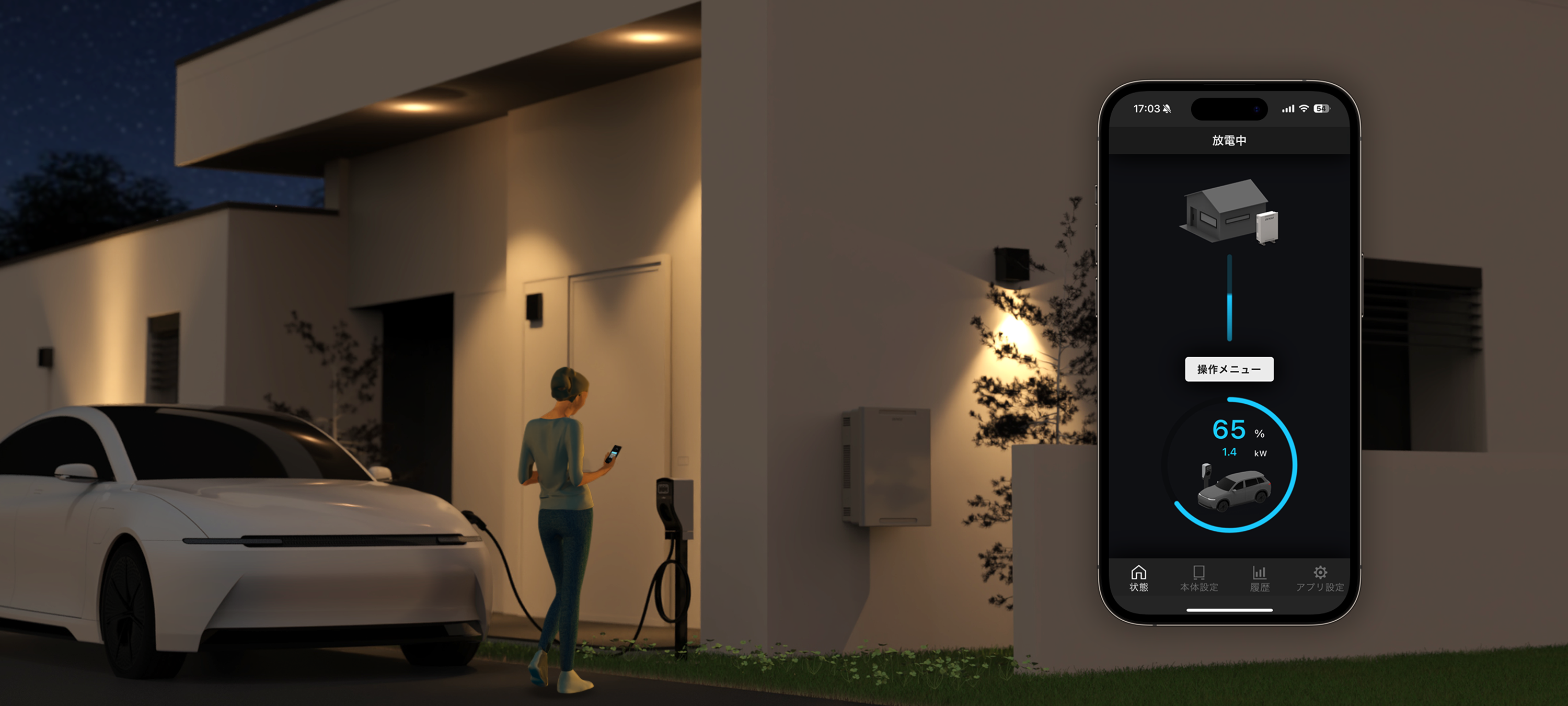
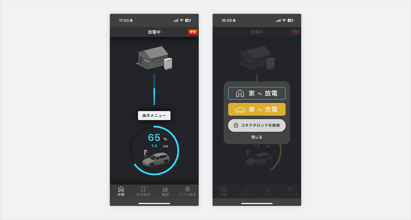
Goi:The app allows users to control charging (transferring electricity from home to the vehicle) and discharging (transferring electricity from the vehicle to the home). In addition to simple operations, it features scheduled power transfers and a history log of past energy flows.
However, the current request focuses on redesigning the initial status check screen and its associated operation screen, which appear when the app is launched.
Ohyama:Since this wasn't a full app overhaul, the business division initially thought the task would be as simple as replacing the existing visuals. We took on the request without much concern.
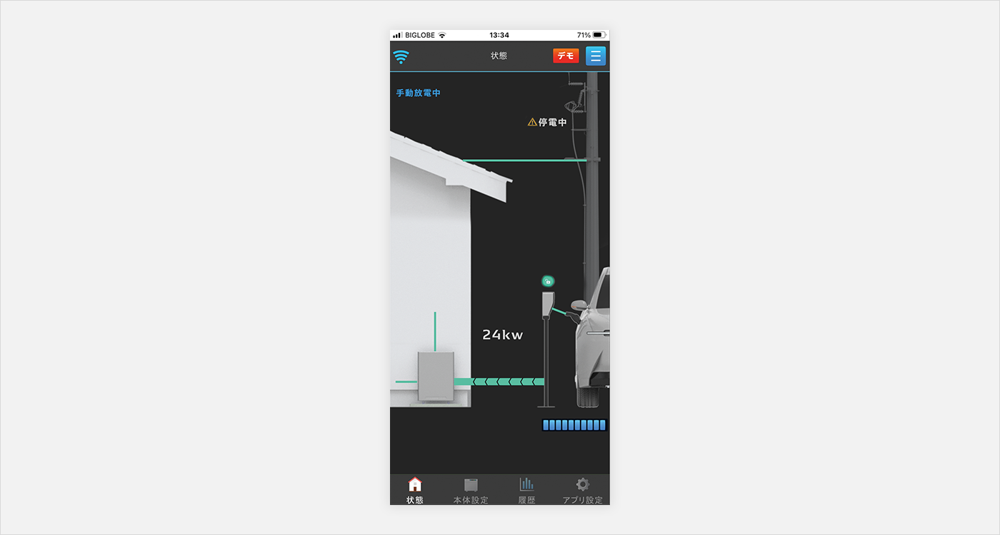
Goi:However, upon closer examination of the existing UI, we noticed several issues: some icons appeared to be buttons but weren't clickable, and users had to consult the manual to locate the charging button. The interface wasn't intuitive.
Exploring the Best UI Structure
Goi:First, we reviewed the role of each display element in the app and prioritized functions accordingly. Once we identified the most crucial elements, we researched how other energy-related apps visualized power flows. Using these insights, we explored optimal ways to present the information.
For example, to illustrate the relationship between the house and vehicle more realistically, we initially designed a screen with an accurate scale representation of the house, V2H system, and power lines. However, the detailed visuals created unnecessary distractions, making it difficult to focus on the essential information.
Goi:This led us to recognize the importance of prioritization. We asked ourselves: What does the user need to see first on this screen? For example, power lines don't always need to be visible, so we refined the screen by selectively removing non-essential elements.
--What were the most challenging aspects of display optimization?
Goi:The biggest challenge was how to represent "charging" and "discharging."
"Charging" refers to power being supplied from the house to the vehicle, while "discharging" means power is supplied from the vehicle to the house. While these terms are clear to us, they could be confusing to general users. Text alone might not effectively convey which direction the electricity is flowing.
However, altering these terms would have required updating all existing manuals and documentation, which wasn't feasible for a partial renewal. Instead, we made slight modifications, labeling the functions as "Charge to Car" and "Discharge to Home" to provide additional clarity. We also introduced intuitive icons to further enhance understanding.
--Why was the operation menu button moved from the top right to the center?
Goi:Good question! In the original UI, the menu button--one of the first things users needed to tap--was located in the hard-to-reach top-right corner. To improve accessibility, we moved it to the center bottom, making it easier to press right after launching the app.
Additionally, when the button is tapped, a pop-up appears instead of switching screens. This allows users to view the current status without losing context.
Graphics Adjustments & Collaboration with the UI Team
Ohyama:Once the structure was finalized, we moved on to fine-tuning the graphics. DENSO has a UI guideline that we referenced for determining colors and font sizes.
--Are the orange and blue colors representing electricity based on the guidelines?
Goi:Yes. While we considered using different colors, this was a partial renewal, so we prioritized maintaining consistency with the app's overall branding.
--Are the orange and blue colors representing electricity based on the guidelines?
Goi:Yes. While we considered using different colors, this was a partial renewal, so we prioritized maintaining consistency with the app's overall branding.
--Why was a black background chosen?
Goi:To emphasize the flow of electricity, we designed the UI to display energy movement from top to bottom. A dark background enhances the visibility of light and energy flow, making it more intuitive.
Additionally, black backgrounds consume less power, contributing to energy efficiency--aligning with our goal of sustainability.
Goi:Once we had a solid design, we gathered feedback from our in-house UI design team. They pointed out issues such as insufficient contrast between button and background colors, and the need to optimize text organization for better visual guidance.Ohyama:
Thanks to their feedback, the UI quality significantly improved. For example, when we analyzed eye-tracking data, we noticed that in the initial design, users' gazes wandered all over the screen. After implementing feedback, their focus was directed efficiently, mainly centered around the operation menu button.
Eye Tracking: Left shows before UI team feedback, right shows after
Eye Tracking: Left shows before UI team feedback, right shows after
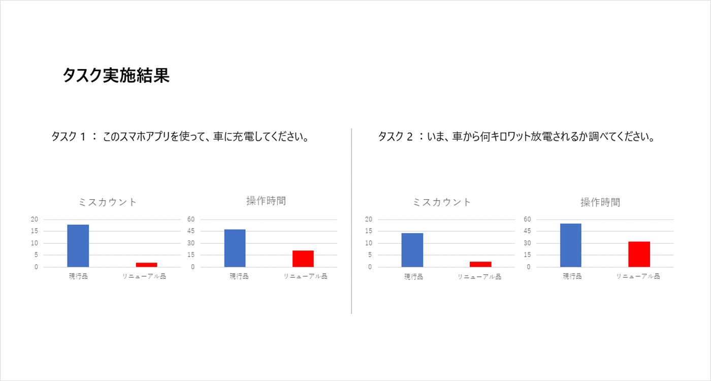
Comparison Test with the Old Model
Ohyama:Finally, to assess improvements, we conducted a comparison test between the old UI and the new design. We measured the time it took for first-time users to complete key tasks.
The results showed a significant reduction in operation time and fewer misclicks, confirming the effectiveness of our redesign.
--That's a great outcome!

Reflections
--Any final thoughts on this project?
Goi:When designing physical products, we focus on intuitive interactions and minimizing hand movements. However, UI design also requires optimizing eye movements. This was a fresh perspective for me, and I found it fascinating.
Ohyama:Because this is an app that users interact with daily, simplicity is key. Our goal was to create a UI where everything could be understood with a single top-to-bottom glance.
Seeing the eye-tracking results confirmed that our approach worked as intended, which was very rewarding.
Tags
Member
Creative Direction: Kohji Ohyama
Project Lead: Shun Goi
UI Design: Shun Goi
Other WorksAll Works


